The Emotions of Color in Marketing and Company Logo Designs
As marketers, we see it all the time… BIG RED LETTERS on landing pages to grab our attention. Different colors make people act differently. RED is usually seen as a “danger” or “warning” color… while BLUE or GREEN is more “soothing” and “trusted“. An excellent example of this was how in Star Wars, Darth Maul is RED and BLACK (representing his evil), and Yoda was GREEN… showing his “stability” and “safety”.
In today’s post I wanted to focus on all of the main colors and how they should be represented in your advertising efforts. Believe it or not, the colors you place on your landing pages or web sites can drastically change your overall conversions and the user’s thinking process. Below is a break down from HP, on the main colors we use for marketing and how they are often looked at by others.
Primary Colors:
|
Red |
Red is a very emotionally charged color. It tends to increase the respiration rate and can even raise your blood pressure. It creates excitement and can be associated with danger, war, power, strength passion, desire and love. It can even increase your appetite.
|
Yellow |
Yellow is the happy color… it is the color of sunshine. It creates a sense of cheerfulness and helps to stimulate mental activity. When yellow is very bright, it can attract attention. It can also provide a very sharp contrast to dark colors. Yellow can have the appearance of being brighter than white if over used and can be disturbing if used too much.
|
Blue |
Blue is a trusted color. It can provide a sense of tranquility and security. It tends to symbolize loyalty, wisdom, trust, faith, confidence, and intelligence. While red can help to increase the appetite, blue tends to have the opposite affect and can actually suppress the appetite.
Secondary Colors:
|
Orange |
Orange is the combination of the happiness of yellow and the energy and strength of red. It symbolizes creativity, determination, enthusiasm and success. In addition orange indicates affordability. Because of its similarity to red, it is great to promote food.
|
Green |
Green tends to suggest endurance and stability. It represents harmony, growth and freshness. Green indicates safety. Obviously, it is associated with money and wealth. With the interest in “green†products, it is the only color that can promote organic foods and products effectively.
|
Violet |
Violet or purple combines the energy and strength of red with the stability of blue. It represents nobility, ambition, power and luxury. It symbolizes extravagance and wealth and is often associated with dignity, independence, wisdom and magic.
Others:
|
White |
White is purity, goodness, light and innocence. It is considered perfection. White is generally positive and simple. Often it is the color of charitable organizations, low-fat foods and dairy products.
|
Black |
Black is elegant, powerful and formal, but can also be associated with death. In marketing, it is dignified. In certain contexts, black is very negative (blacklist, black humor, etc). It can also denote prestige.
Psychology of Colors in Logo Design and Branding
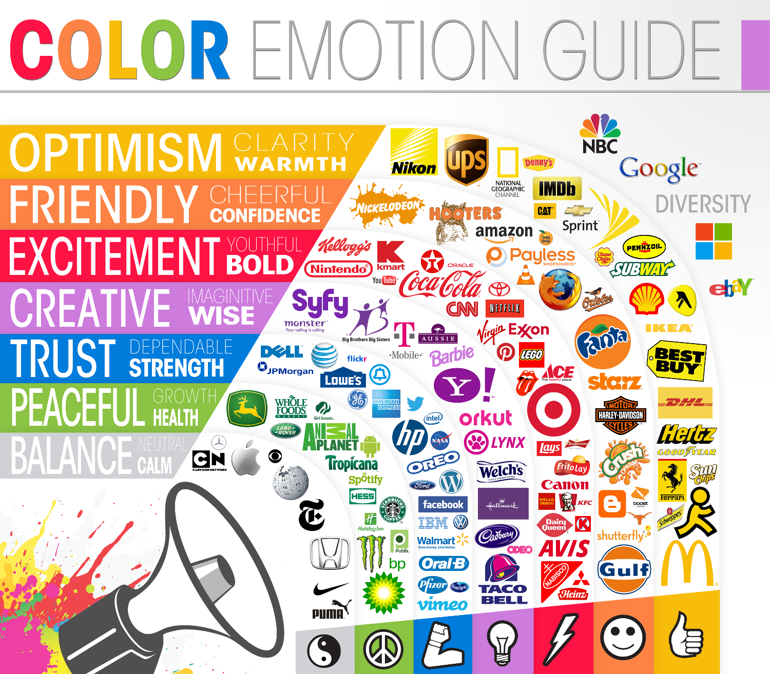
As you can imagine, this all plays a massive role in how advertisement and brands use different images. Be sure to look through the Color Emotion Guide infographic below to see how many of your favorite brands and logos you can find, while also checking out how their color might play a role with the emotions they are supposed to emit. A perfect example of this would be “Green Companies” and how they are using the color to show off their “Peaceful, Growth and Health” emotions to target their audience and better relate with them. Such examples of “green brands” include Whole Foods, Tropicana, Animal Planet and Hess.

Next time you are working on your landing page or new web site, step back and look at your color scheme and see how your colors are targeting your audience.


